
The essentials for bringing AYNA into your story. Our logos, colours and typography, all in one place.

Made to move with you.
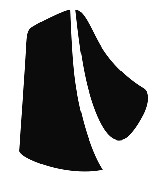
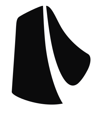
A flowing symbol. A distinctive wordmark. One identity.Original artwork, ready to use. Choose the version that gives the logo the clearest contrast.


A quiet, neutral palette keeps the focus on the clothes and the person wearing them.
Brand mark & dark surfaces
Canvas & reversed marks
Soft backgrounds
Supporting text
Instrument Sans is our web typeface. Clean, open letterforms give both fashion imagery and everyday details room to breathe.
The AYNA wordmark is artwork. Always use the supplied file instead of typing it out.
Your next look. On you.
Regular · Body copy400
Medium · Labels & controls500
Semibold · Headlines600
A few simple principles help our identity feel consistent wherever it appears.
Keep text and other graphics away from the mark. Leave at least a quarter of the mark’s height clear on every side.
Use the dark artwork on light backgrounds and the white artwork on dark backgrounds. Avoid busy photographs behind the logo.
Keep the original proportions and orientation. Don’t stretch, recolour, add shadows or recreate the lettering.
Write AYNA in uppercase. Use our assets to identify AYNA, without suggesting an endorsement or partnership.